


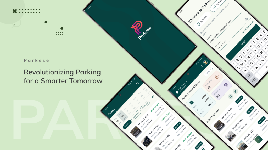
PARKESE
Parkese is a software that helps to Manage and secure parking area using ALPR which works in...
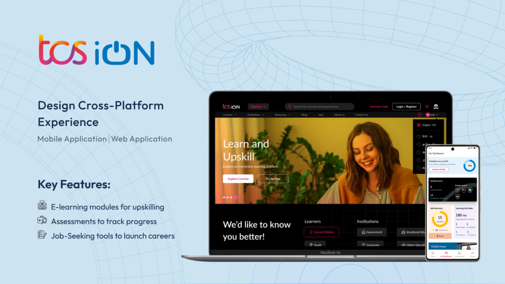
Designed TCS iON’s platform and mobile app to enhance learning,assessments, job search, and training...
An Exploratory Project
BILGAMESH
product document
WHY Bilgamesh ?
Ownership of value has evolved throughout...